question 1
this magazine is of the female lifestyle magazine genre and this is shown the title 'Easy Living' which paints the picture of a handy magazine full of tips for the modern woman. another way which the extract fits the genre of which its in is by the cover line 'what your friends really think of you', this is because women typically have untrusted/gossipy friends who talk behind their back and men are typically more forward and literal with what they say and fight by using fits rather than mind games therefore secrets are less devious than womens.
question 2
the layout of the magazine cover creates the effect of organisation and clarity as the left third is clearly presented with very little change in font or text colour, therefore the coverlines are easily read and presented in an organised and proper fashion. the typography used on this magazine cover is very static and unchanging creating the effect of consistency, yet also the font used is very modern and the consistency creates the effect of this being a very modern and up to date magazine (which most 21st century women want).
question 3
in this magazine young to middle aged women are being represented. from this magazine we can see that supposedly these women value knowledge of things their friends my be thinking of them, celebrities (and their eternal youth), fashion and cooking. this may be detrimental to the group of women this is aimed at as they are shown all to look like a 'perfect' figure and be into cooking, fashion and gossip whereas this is almost definitely not what all women value or even want to know about.
going back to the image of the 'un-aging' celebrity on the front cover, this could be bad for both a woman's morale and what is expected of her as this shows a 'perfect' model of a woman which not every woman is and that can put a picture in a mans mind of all women within this age group looking like beautiful un-aging models which can offend women and bring much disappointment to men. another problem with this image is that it may bring depression and obsession to women that don't look like the model on the front page as society has dictated that she is beautiful and anything other than her hair, body type or facial features are unworthy of the word 'beauty' which many women wont have as every woman is different.
the coverlines that were previously mentioned could be detrimental to women because of once again expectance of women and women feeling like they have to be interested or involved in gossip, cooking, fashion and celebrities. If a man were to glance on the cover of this magazine he could easily come to the conclusion of all women liking the things that are displayed upon the coverlines, this could put the men in trouble as he could easily think true of the belief of that stereotype making it a shock if the woman he meets does not follow that formula/stereotype of women it may him think she's abnormal. to women the pressure of this stereotype may make them question weather they are 'normal' or not therefore, making a society of women needing to be up to date with fashion, gossip and other things just to feel acceptance from other women.
Friday, 13 June 2014

Thursday, 27 March 2014
Thursday, 20 March 2014


Monday, 10 March 2014

Thursday, 27 February 2014

direct adress: the model in this case fergie from black eye peas is looking directly into the camera and therefore at you, and there is a direct coverline saying 'your body' therefore talking to you.
language: in this particular magazine the language seems to be quite informal and gossipy as if the magazine was revealing things to the reader.
aspirational: the coverline 'win the sex factor' is aspirational as everyone wants to be the best at sex, also the 'your body only firmer' coverline is aspirational as people want the best body.
you can see that the magazines target audience is female due to the colour scheme and also the fact that men don't really care about having a firmer body and they do not need to hear 'why every woman should date an ugly man' and men don't typically care too much about fast fashion updates.
this magazine is a lifestyle magazine which has content about sex, making your body the best, fashion and gossip also the celebrity on the front (fergie) is quite influential or at least was at the time and the magazine has content on gossip about that female.
Monday, 10 February 2014

www:
- good choice of title and cover lines that relate to teenage girls
- the main image is of a well known celebrity loved by teenage girls
- the colour choice for the background is a very nice fade from white to pink/purple
EBI:
- the cover lines could have had a wider range of font styles
- possibly more colour could have been used in the title and coverlines
- possibly more coverlines could have been used to fill the page
Friday, 24 January 2014
cover lines:
- 5 quick fashion tips
- how to get the boy you want
- 10 facts about the latest boy-bands
- J.B. interview
- hottest actors of 2013
- how you can get J.B.
- spice up your school wear
- do's and don'ts of getting your guy
- how you can get the perfect body
- how you can look like taylor swift
titles:
- young life ( I choose this one as it is mature but also sounds as if it were for teens)
- real girls
- teen life
- 5 quick fashion tips
- how to get the boy you want
- 10 facts about the latest boy-bands
- J.B. interview
- hottest actors of 2013
- how you can get J.B.
- spice up your school wear
- do's and don'ts of getting your guy
- how you can get the perfect body
- how you can look like taylor swift
titles:
- young life ( I choose this one as it is mature but also sounds as if it were for teens)
- real girls
- teen life
Wednesday, 15 January 2014
TYPOGRAPHY
WORKSHEET
Study the Cosmopolitan front cover and answer the
questions on lined paper, in full sentences, using media key terms.

Questions:
- How
many different font styles do you see on the front cover?
30
- How
many different font sizes are used?
19
- How
many different font colours are used?
3
- How
many coverlines are there?
8
- Describe
the font used for the magazine title.
It is bold, clear and big so people can read and
recognise it.
- How
does the title communicate who the target audience are?
It is pink yet bold and affirmative so it is probably
for women
- What’s
the main coverline and how do you know?
‘Body revolution’ as it is the coverline that takes up
the most space
- Explain
how and why different colours are used on the cover.
White is used to show the main point then pink is for
additional information as is black
- Explain
how and why different fonts are used on the front cover.
The different fonts are affected by the type of word
e.g. ‘body’ has a curvy and stylish font
- If
you could change something about the typography on this cover what would
it be and why would change it?
I would change the colours as I find them to monotone
even though they are completely different.
Monday, 13 January 2014
symmetrical magazine front cover

I chose this cover as being balanced since the logo, image and text all went from the middle third outward and the face is very symmetrical with the make up and facial features.
asymmetrical magazine front cover

I chose this cover as asymmetrical since it has rick ross standing at and angle and it has text that is not in a regular place but is in-between the left and centre third.
asymmetrical magazine front cover by colour

I chose this cover as it had a lot of bright and vivid colours in the foreground and it also has a lot of drowned out colours in the background
Friday, 10 January 2014

modern:
I chose this font as it is simplistic and smart which is the way I find the future heading it is also a font i have seen used in many futuristic movies.
kids:
I chose this font as it is playful and friendly which are things that I relate to kids.
sport:
I chose this font as it is a typical american style sporting font which is used in american football, basketball and baseball.
masculine:
I chose this font as it is big, bold and agressive which are typical male attributes.
feminine:
I chose this font as it is light, swirly and what can be conceived as naturalistic which is a typical look for women.
sophisticated:
I chose this font as it has little flourishes and looks quite posh a sort of serif type font.
BOLD:
I chose this font as it is thick and Bold which i needed as it is bold and quite self explanatory.
history:
I chose this font as I find it to be a classical medieval font used in films such as 'monty python holy grail'
Sunday, 15 December 2013
Direct address and
aspirational cover lines on ‘prima’ magazine’s front page
Prima magazine includes many aspirational cover lines such
as ‘our top 20 summer dresses’, this is an aspirational cover line as women
aspire to be the best looking person around for a strange competitive reason
that has been worked over the years by the media. This both makes women want to
buy the magazine for the sake of looking like the norm and also to get the
upper hand over other women. This also applies for fashion tips yet by the
cover line ‘enjoy summer for free’ I can tell this magazine is for the more
down to earth affordable fashion and beauty tips for mothers or older women
that just wish to try to keep with the times.
The direct address on this front page is mainly coming from
the main image which is a lady whom is looking directly into the camera lens
which makes the illusion of her always making eye contact with you. This makes
the customer feel more involved in the magazine and are possibly compelled to
look at the magazine as it appears to be looking at you. The cover line ‘you
look gorgeous’ makes the reader feel confident and possibly more inclined to
reading the magazine due to this compliment.
Denotation and connotation
of prima magazine front page layout
The front page of prima magazine consists of the regular
lifestyle magazine layout including a: masthead, selling line, dateline, main
image, model credit, bar code, the cover lines, the main cover line and the left
third which contains the majority of the cover lines, due to shelf stacking. Here
is an image of what these words mean.

Prima’s
front page has the selling line of ‘JOIN IN & WIN! Puzzles …. Competitions &
cash prizes’ cover lines include ‘ our top 20 summer dresses’ ‘you look gorgeous
72 top-to-toe beauty tips’ ‘TOO SHY TO ASK YOUR GP?’ and many more. It’s
masthead is obviously ’prima’ and its dateline is secured under the title. From
this we can tell it is not a sexual magazine like cosmopolitan as its selling
line is about puzzles and prizes. We can also tell that it is a fashion and
beauty with the cover lines of ‘top 20 dresses’ and ‘72 top-to-toe beauty tips’.
The main image is of a healthy woman whom some other women may consider idealistic
which may persuade women to read the magazine as most women do seek to be
idealistic and the dateline, bar code and model credit is fairly straight forward
and self explanatory.
Sunday, 17 November 2013
jessie j - do it like a dude
- quick frantic shots showing she's powerful and a bit mad
- strong and aggressive movements that imitate male aggression toward each other
- there is juxtaposition when the line 'do it like a dude' is said and jessie j comes in meaning she is as powerful as a man
- women are fighting and being aggressive toward one and other which are typical manly traits
- they dance like men meaning she can do whatever a man can do
- this video is trying to show that women are able to do what ever a man can do weather that be dancing gambling fighting or being aggressive toward each other meaning men and women are equal.
Christina Aguilara
- sexual dancing with camera facing there butt and wide shots to show all of the back up dancers.
- wrestling ring to show that she is fierce and sexy
- fighting but it is fake 'sexy' fight
- pans and wide shots are used to show all the 'dancing'
Thursday, 24 October 2013
the gradient tool
this tool is essential due to the fact that it can transition from one layer to another.

this can be done by clicking on the tool selecting the options that you require and either fading in or fading out or making one layer shine through the fore ground.
this is what you are able to do with the fading tool.
Sunday, 13 October 2013
Tuesday, 1 October 2013
50 Cent - Candy Shop
This rap suggests that if you have a cool
car and cool clothes you will have sex with many pretty ladies
Setting an 'example' which men should
supposedly follow. This creates a mislead example for the younger generation
one that money can get you love and women are just sex objects and two is that
all women are sexy and slutty meaning that it does not matter about future
relationships. this will make women not trust men and a
lot of teenage pregnancies occur this is in the long run will create a lot
of inefficient jobs as everyone is addicted to sex meaning a lot of
homelessness occurs due to work not being completed.
Yet I am thinking of too many extremes in
the real world what will happen it will make many adolescent boys horny which
in the long run won’t do much yet it does set a bad example for a young
un-moulded mind and could make this child set out from its peer group. In
simple terms I prefer rap music that has a good beat a nice flow and in general
sounds good which to me means I don't like this song and I am also strongly
against the objectification of women. I find this to be very ignorant and think
of my sister and if she was talked about like that it would make me furious.
Jay z - big pimpin'
This music video promotes the rich wasting
money life style and also the prostitution of women e.g. the title. This port
trail of masculinity includes having sex with many women and spending lots of
money and wearing trendy clothes with a couple of golden chains around your
neck. This sets a standard to which not many can follow as money is very hard
to come by at this day and age. It also leads an unhelpful example for children
as it promotes smoking and not having a satisfying relationship with a woman
but going from one woman to another. I think this example is not good as
treating women as sex objects is very rude and disrespectful.
The way men are perceived by women
is as these sexually frustrated, dirty rich lady killers from videos like this,
I find this to be wrongful and frustrating in that women may be making
assumptions of men.
(word count: 396)
Friday, 20 September 2013
This is my logo for a television series at ravenswood school, it includes: technology, school disputes, work and sport, all these things are featured in schools across the UK making this a generic look into secondary school life. The technical aspects include adding many pictures to a base background (which is the green fading to black base) the pictures on top of the base picture have that ghost sort of effect which is created by lowering the fill of the image and so it starts to blend in to the background. I created the writing to personify the text so the 'study hard' is in a handwriting type of font and the 'play harder' is in a bold less serious font but is meant to also have that seriousness about it since the fun is people doing bad things in general.


Thursday, 19 September 2013
the magic lasso tool is used to separate two objects that are close to each other this will highlight the edges of a shape and allow you to move it.
this is the icon that is shown on the left hand side of your screen.

 if you were to double click it you would be able to adjust the frequency at which it works this means you can change the diameter and the contrast from a scale of 1 to 100.

this is the icon that is shown on the left hand side of your screen.
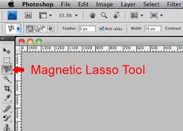 if you were to double click it you would be able to adjust the frequency at which it works this means you can change the diameter and the contrast from a scale of 1 to 100.
Subscribe to:
Posts (Atom)