
Friday, 20 September 2013
This is my logo for a television series at ravenswood school, it includes: technology, school disputes, work and sport, all these things are featured in schools across the UK making this a generic look into secondary school life. The technical aspects include adding many pictures to a base background (which is the green fading to black base) the pictures on top of the base picture have that ghost sort of effect which is created by lowering the fill of the image and so it starts to blend in to the background. I created the writing to personify the text so the 'study hard' is in a handwriting type of font and the 'play harder' is in a bold less serious font but is meant to also have that seriousness about it since the fun is people doing bad things in general.

Thursday, 19 September 2013
the magic lasso tool is used to separate two objects that are close to each other this will highlight the edges of a shape and allow you to move it.
this is the icon that is shown on the left hand side of your screen.

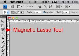 if you were to double click it you would be able to adjust the frequency at which it works this means you can change the diameter and the contrast from a scale of 1 to 100.

this is the icon that is shown on the left hand side of your screen.
if you were to double click it you would be able to adjust the frequency at which it works this means you can change the diameter and the contrast from a scale of 1 to 100.Sunday, 15 September 2013
Denotation and connotation:
Iron maiden – it has bright colours with a demon skeleton lady and a devil with the writing the number of the beast. Iron maiden is a rock band and maybe this insinuates that they worship the devil.
Bruce Springsteen- the iconic song born in the USA. It has a mans bum with a red/pink hat in his pocket all of this is in front of the American flag. This all is meant to be very patriotic and typical of America
The strokes – it is a very pale woman’s bum being stroked like the band name and it’s all rather colourless. The meaning could be that the music is very seductive and sexual otherwise I cannot think of much.
Queen – the band all together in the darkness with light on their faces and one has his arms crossed. It could be them going up to heaven with the light on their faces and the arms crossed. the writing is the medieval style first series of black adder looking font showing they are important and a classic rock act.
Unknown pleasures – sound waves that look a lot like
mountains. That music can be really powerful.
Wish you were here – two men in suites one on fire shaking hands in the middle of a storage place.
One man is evil and is selling bad stuff to the guy not on fire.
The who – 4 men standing on rubble with mounds of rubble behind them with a white stone cuboid in the middle. Looking on reflection after their lives have changed into rubble.
Soulwax – pink diagonal lines that in the middle spell something that I can’t quite make out. Things are confusing or read between the lines.
Blondie – 5 white guys in black suits and a white girl in a white dress in the middle with black and white stripped background. Everything is black and white there is no grey. the writing used looks very 60's looking a bit like happy days.
Miles Davis – a guy in the dark with a white light on his
own. He is thinking on his own being with himself and viewing his self
reflection.
Friday, 6 September 2013

Monday, 2 September 2013

Sunday, 1 September 2013
movie was terrible yeah sure a cool bit of action but then its ruined by a teenage love thing which overruled all my thoughts of the characters and made me hate them all. worst part being the lead characters thought they could be related and still hit on each other *ugh*. but this song is awesome and making me feel good.rizzle kicks demolition man
Subscribe to:
Posts (Atom)